Introduction to Charts in SwiftUI

Bruno Lorenzo
7 min readJan 23, 2024
Image by Author

When it comes to presenting information to users, easier is better.

Especially when we're dealing with large sets of data. We have different options like custom views, tables, summaries, etc. However, we can take a much richer experience path, and use some graphical presentation.

By using charts, users can get, at first sight, a better understanding of the data presented.

If you're looking to elevate your app's engagement, let me show you a quick, easy-to-follow guide on how we leverage charts to do it.
Source code available here

The basics

We create a chart by composing a series of chart elements. These elements must conform ChartContent protocol and represent types that can be drawn in a chart's scope.

To create a chart, we use the init(content:) method. In the ViewBuilder closure, we add all the visual elements needed.

struct ChartView: View {
var body: some View {
ChartView {
// Chart elements
}
}
}

Ok, but what elements can we add?

Charts framework has a pre-defined set of ChartContent ready to use called Marks. You can see a Mark as a graphical element that represents data.

Image by Author

Each Mark type has several initializers to use depending on what UI we want to achieve.

We can use 3 types of data in charts

  1. Quantitative: Numerical values like Int, Double, and Float.
  2. Nominal: Discrete categories or groups.
  3. Temporal: Point in time.

Depending on the data type that we use, the configurations that we can apply to manipulate the charts' UI.

Show me the code πŸ€“

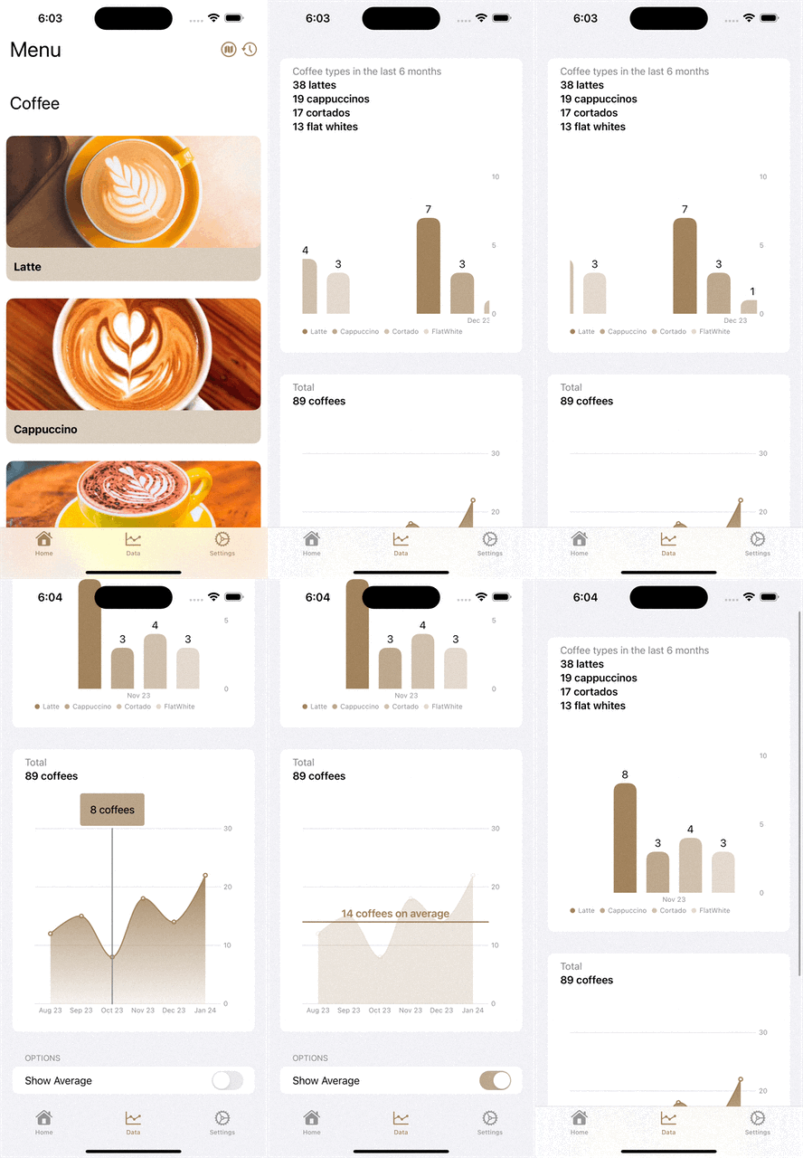
For our demo, we want to present the number of coffees that users consume over time, grouped by type (latte, cappuccino, cortado, and flat white).

So let's start by creating a simple bar chart showing the total number of coffees.

struct CoffeeData: Identifiable {
typealias CoffeeDetails = (type: Coffee, amount: Int)
let id = UUID()
let date: Date
let details: [CoffeeDetails]

static func mockData() -> [CoffeeData] { ... }
}

struct DemoChart: View {
@State private var coffeeData = CoffeeData.mockData()

var body: some View {
Chart {
ForEach(coffeeData, id: \.id) { coffeeInfo in
BarMark(
x: .value("Date", coffeeInfo.date),
y: .value("Coffee", totalCoffees(in: coffeeInfo.details))
)
}
}
.frame(height: 300)
.padding()
}

func totalCoffees(in details: [CoffeeData.CoffeeDetails]) -> Int {
return details.map({$0.amount}).reduce(0, +)
}
}
Image by Author

Customizing the chart

To differentiate the data by coffee type, we need to do an extra iteration through CoffeeDetails and use foregroundStyle(by:) modifier to group the information.

struct DemoChart: View {
@State private var coffeeData = CoffeeData.mockData()

var body: some View {
Chart {
ForEach(coffeeData, id: \.id) { coffeeInfo in
ForEach(coffeeInfo.details, id: \.type) { coffeeDetails in
BarMark(
x: .value("Date", coffeeInfo.date),
y: .value("Coffee", coffeeDetails.amount)
)
.foregroundStyle(by: .value("Coffee Type", coffeeDetails.type))
}
}
}
.frame(height: 300)
.padding()
}
}
Image by Author

With this little change, we got our data grouped. However, this type of chart is mostly used when you want to show progress on certain values.

In our case, we're looking for one bar for each coffee type, which means that for every X-value (aka month) we will need 4 bars (Latte/Cappuccino/Cortado/FlatWhite). To do this, we need to do two changes:

  1. Use unit option in our X-axis values to indicate that we want to group the values by month.
  2. Use position(by:axis:span:) modifier to actually create a grouped bar mark.
struct DemoChart: View {
@State private var coffeeData = CoffeeData.mockData()

var body: some View {
Chart {
ForEach(coffeeData, id: \.id) { coffeeInfo in
ForEach(coffeeInfo.details, id: \.type) { coffeeDetails in
BarMark(
x: .value("Date", coffeeInfo.date, unit: .month),
y: .value("Coffee", coffeeDetails.amount)
)
.foregroundStyle(by: .value("Coffee Type", coffeeDetails.type))
.position(by: .value("Coffee Type", coffeeDetails.type))
}
}
}
.frame(height: 300)
.padding()
}
}
Image by Author

We can continue modifying the chart to meet our needs

Custom bar colors

Use chartForegroundStyleScale(_:) modifier. Just need to give every option that we use in the grouping a value. In our case: Latte, Cappuccino, Cortado & FlatWhite.

Changing scale

If we want to control the values displayed in the axis to make the chart marks bigger or smaller, we can use chartYScale(domain:type:) & chartXScale(domain:type) modifier. Domain can be a closed range (like 0 to 15) for Quantitative and Date types, or an array of values for Discrete types.

Configure axis labels

In our case, it would be better if we show on X-axis the month together with the year, for example, Aug 2023. chartXAxis(content:) modifier allows us to do this.

Add annotations

Sometimes, we need to include extra information in the chart marks to make it more readable. Using annotation(position:alignment:spacing:content) we can place any view together with the marks.

struct DemoChart: View {
@State private var coffeeData = CoffeeData.mockData()

var body: some View {
Chart {
ForEach(coffeeData, id: \.id) { coffeeInfo in
ForEach(coffeeInfo.details, id: \.type) { coffeeDetails in
BarMark(
x: .value("Date", coffeeInfo.date, unit: .month),
y: .value("Coffee", coffeeDetails.amount)
)
.annotation(position: .top, alignment: .center) {
Text("\(coffeeDetails.amount)")
}
.foregroundStyle(by: .value("Coffee Type", coffeeDetails.type))
.position(by: .value("Coffee Type", coffeeDetails.type))
.cornerRadius(12)
}
}
}
.chartForegroundStyleScale([
Coffee.latte: Color.accentColor,
Coffee.cappuccino: Color.accentColor.opacity(0.7),
Coffee.cortado: Color.accentColor.opacity(0.5),
Coffee.flatwhite: Color.accentColor.opacity(0.3),
])
.chartXAxis {
AxisMarks(values: .stride(by: .month, count: 1)) { _ in
AxisValueLabel(format: .dateTime.month(.abbreviated).year(.twoDigits), centered: true)
}
}
.chartScrollableAxes(.horizontal)
.chartYScale(domain: 0 ... 15)
.frame(height: 300)
.padding()
}
}
Image by Author

Composing & Interactivity

Remember when I said that we create a chart by adding different ChartComponent ? These components don't necessarily need to be the same type.

Image by Author

We can combine a LineMark with an AreaMark to achieve this UI.

struct OverallData: Identifiable {
let id = UUID()
let date: Date
let coffee: Int

static func mockData() -> [OverallData] {

return [
.init(date: Date(year: 2023, month: 08), coffee: 12),
.init(date: Date(year: 2023, month: 09), coffee: 15),
.init(date: Date(year: 2023, month: 10), coffee: 8),
.init(date: Date(year: 2023, month: 11), coffee: 18),
.init(date: Date(year: 2023, month: 12), coffee: 14),
.init(date: Date(year: 2024, month: 01), coffee: 22),
]
}
}

struct DemoChart: View {
@State private var overallData = OverallData.mockData()

private var areaBackground: Gradient {
return Gradient(colors: [Color.accentColor, Color.accentColor.opacity(0.1)])
}

var body: some View {
Chart(overallData) {
LineMark(
x: .value("Month", $0.date, unit: .month),
y: .value("Amount", $0.coffee)
)
.symbol(.circle)
.interpolationMethod(.catmullRom)

AreaMark(
x: .value("Month", $0.date, unit: .month),
y: .value("Amount", $0.coffee)
)
.interpolationMethod(.catmullRom)
.foregroundStyle(areaBackground)
}
.chartXAxis {
AxisMarks(values: .stride(by: .month, count: 1)) { _ in
AxisValueLabel(format: .dateTime.month(.abbreviated).year(.twoDigits), centered: true)
}
}
.chartYScale(domain: 0 ... 30)
.frame(height: 300)
.padding()
}
}

We can continue this combination and add a RuleMark together with a custom view as Annotation to allow users to select a specific point to see the value.

Image by Author
struct DemoChart: View {
@Environment(\.calendar) var calendar
@State private var coffeeData = CoffeeData.mockData()
@State private var overallData = OverallData.mockData()
@State private var chartSelection: Date?

private var areaBackground: Gradient {
return Gradient(colors: [Color.accentColor, Color.accentColor.opacity(0.1)])
}

var body: some View {
Chart(overallData) {
LineMark(
x: .value("Month", $0.date, unit: .month),
y: .value("Amount", $0.coffee)
)
.symbol(.circle)
.interpolationMethod(.catmullRom)

if let chartSelection {
RuleMark(x: .value("Month", chartSelection, unit: .month))
.foregroundStyle(.gray.opacity(0.5))
.annotation(
position: .top,
overflowResolution: .init(x: .fit, y: .disabled)
) {
ZStack {
Text("\(getCoffee(for: chartSelection)) coffees")
}
.padding()
.background {
RoundedRectangle(cornerRadius: 4)
.foregroundStyle(Color.accentColor.opacity(0.2))
}
}
}

AreaMark(
x: .value("Month", $0.date, unit: .month),
y: .value("Amount", $0.coffee)
)
.interpolationMethod(.catmullRom)
.foregroundStyle(areaBackground)
}
.chartXAxis {
AxisMarks(values: .stride(by: .month, count: 1)) { _ in
AxisValueLabel(format: .dateTime.month(.abbreviated).year(.twoDigits), centered: true)
}
}
.chartYScale(domain: 0 ... 30)
.frame(height: 300)
.padding()
.chartXSelection(value: $chartSelection)
}
}

Takeaways

  1. Think about what you want to show to users before thinking about graphical elements. What do you want to transmit?
  2. Focus on data modeling. How you model your data will be directly related to how easy the chart will be to work with.
  3. Give users a first peak of the data they will find in the chart by presenting some grouped information.
  4. I showed some basics to start working with charts. However, there are many more configurations and tweaks that we can use to make our charts even better. I recommend you take a look at the official Apple's charts documentation to dig deeper and watch WWDC sessions.

Have any questions? Feel free to drop me a message! πŸ™‚

  • πŸ€“ Join me on X for regular content on iOS development tips and insights
  • πŸš€ Check out my GitHub where I share all my example projects

--

--

Bruno Lorenzo

Software Engineer | Innovation Manager at www.houlak.com | Former iOS Tech Lead | I write about iOS, tech, and producitivy